
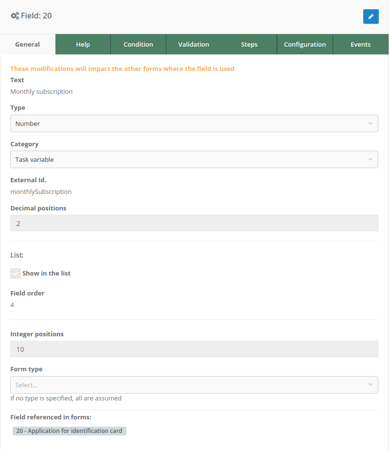
General
The first tab, called “General,” displays key information and options related to the selected field in the section. This tab provides a comprehensive view of the field and allows modifications as needed.
Campos
1. Text
This field shows the current name of the field. It can be modified according to user requirements to accurately reflect the purpose or function of the field within the form.
2. Type
This section specifies the type of field selected, such as a combo menu, text, number, etc. If necessary, this field type can be changed to better suit the specific needs of the form.
3. Category
This is a classification to which the field belongs. It helps organize and distinguish fields, which is useful for processing in form events, where differentiation is required.
Currently, the available category options are “Event Variable” and “Task Variable.” These options can be customized in the Pragmatic server settings to meet the project’s specific needs.
4. External Id
The external id is a unique identifier assigned to the field. This id is used to link the field to other platform functionalities, such as form event usage.
5. Unique name
This is an optional property that allows specifying a new identifier for a field. This identifier is unique across all fields and is useful for use with the @respuesta parameter in datasources, events, validations, and visibility conditions.
6. Integer positions
This field is available only for the “Number” field type. It defines the maximum number of integer positions the field can accept.
The maximum allowed limit is 14 integer positions. This setting ensures that entered values are appropriate for the form’s context and do not exceed established limitations.
7. Decimal positions
Similar to the integer positions field, this field is available only for the “Number” and “Percentage” field types. It defines the maximum number of decimal positions the field can accept.
The maximum allowed limit is 2 decimal positions. This setting ensures that numerical values are precise and suitable for the form’s purpose.
8. Field referenced in forms
This section provides information about other forms where the same field is used. It is essential for understanding the impact of any changes made to this field since any modification here will affect all forms using it.
9. Show in the list
This option allows including the selected field’s response value in the GET service of the form instance list. When enabled, the field’s value will appear under a key called “datos” within the service response.
Additionally, when this checkbox is selected, an optional field is enabled where the user can define the numerical order in which the field’s value will be displayed in the list.
Example:
If two fields are configured in the form:
- Full Name with order 1
- Email Address with order 2
In the GET service response, the “datos” property will be organized according to the established order, ensuring that the full name appears before the email address.
[
  {
    //...
    "id": 9,
    "descripcion": "User Registration Form",
    "datos": "David Alejandro Martínez - david-2000@gmail.com",
    //...
  }
]
10. Mask
This option is available exclusively for Text fields and allows defining how the entered content will be displayed. There are two types of available masks:
Password mask
Hides the field content by replacing it with asterisks. A visibility toggle button is included to the right of the field to switch between showing and hiding the content.
Custom mask
Allows defining a specific pattern that the entered value must follow. Additionally, there is an option to enter values from the right side. The permitted characters in the mask are:
#: Digit (0-9)A: Uppercase letter (A-Z)a: Lowercase letter (a-z)*: Any character
Examples
1. Password mask
A user enters a password, but when displayed in the interface, it is hidden with asterisks: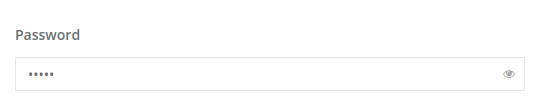
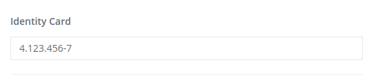
2. Custom mask - Identity card
If the custom mask is set with the format #.###.###-#, and the user enters the value 41234567, the response will be displayed with the applied mask: